The Challenge of Tabs
Tabs can be deceptively simple, but under the surface they come with complex usability and accessibility considerations.
Some of the key issues you need to solve when creating tabs:
- What happens when tabs exceed the width of the screen?
- Should tabs work as in-page navigation or update the URL?
- How do we support users at 400% zoom or on screens narrower than 320px?
Exploring Overflow Solutions
We considered three possible options for the tab overflow design. Each option had trade-offs depending on content density, accessibility, and implementation constraints.
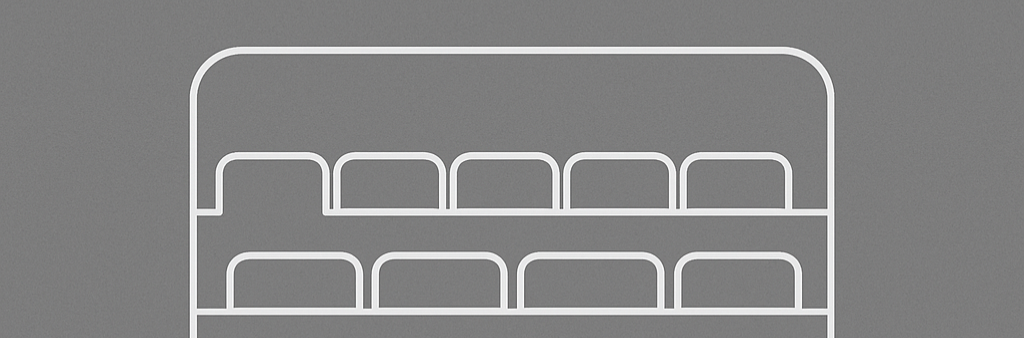
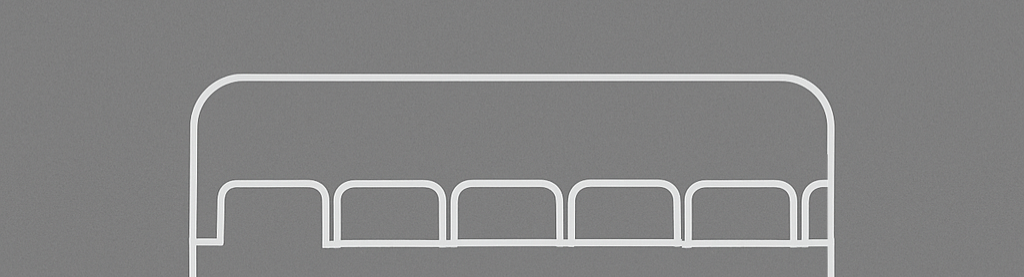
Option 1: Stacked Tabs
Tabs overflow to a second row when there isn’t enough room on screen.
Pros
- All tabs remain fully visible
- No learning curve required
- Excellent accessibility support
- Simple CSS implementation
- Mobile-responsive by nature
Cons
- Consumes significant vertical space
- Can cause layout shifts
- Looks messy with many tabs
- Breaks traditional tab metaphor
- Limited scalability
Option 2: Tabs with a Dropdown Menu
Tabs that don’t fit on screen move into a dropdown style menu.

Pros
- Most space-efficient option
- Clear content hierarchy
- Familiar UI pattern
- Prevents overwhelming users
- Clean, minimal appearance
Cons
- Hidden functionality requires discovery
- Two-step interaction required
- Tab prioritization challenges
- Responsive complexity
- Users lose spatial memory
Option 3: Tabs with Horizontal Scrolling
Tabs slide side-to-side using a horizontal scrollbar.
Pros
- Maintains single-line layout
- Scales to unlimited tabs
- Familiar scrolling interaction
- Preserves tab metaphor
- No content layout shifts
Cons
- Hidden tabs not immediately visible
- Requires scroll indicators that can be inconsistent
- Additional interaction needed
- Mobile touch conflicts
- Navigation friction
Enter AI-Assisted Prototyping
Working through these different complexities in flat files and mockups would be challenging. Rather than mock up each version in Figma, I turned to ChatGPT to prototype them directly in code. I described the desired behavior, required it to use the USWDS as a framework, and it returned HTML, CSS, and JavaScript that I pasted into CodePen.
It wasn’t entirely hands-free. There were major adjustments needed to update styles and refine the code. However, the AI-generated base saved hours of work. The end result was:
- A working prototype I could test at different screen sizes
- Real code I could hand off to developers
- A shareable demo for async feedback from the team
Here are the final demos I created:
Stacked Tabs
Tabs with a Dropdown Menu
Tabs with Horizontal Scrolling
Final Thoughts
Some components are better tested in code than in static mockups. Tabs are one of them. This process made the handoff smoother and the design decisions clearer.
Many refinements, like adding design system tokens and understanding what line colors and focus states look like, were added by hand, but I really valued having support with the complicated JavaScript coding that was necessary. Is this production ready? Far from it, but it creates a better experience for everyone involved than mockups and design specifications alone.
Note: This article was co-written with the help of AI to improve clarity and structure.